BrickflowUI Theming
BrickflowUI supports product-level theming, branded loading experiences, local media assets, dual dark/light modes, and additive style presets directly from Python.
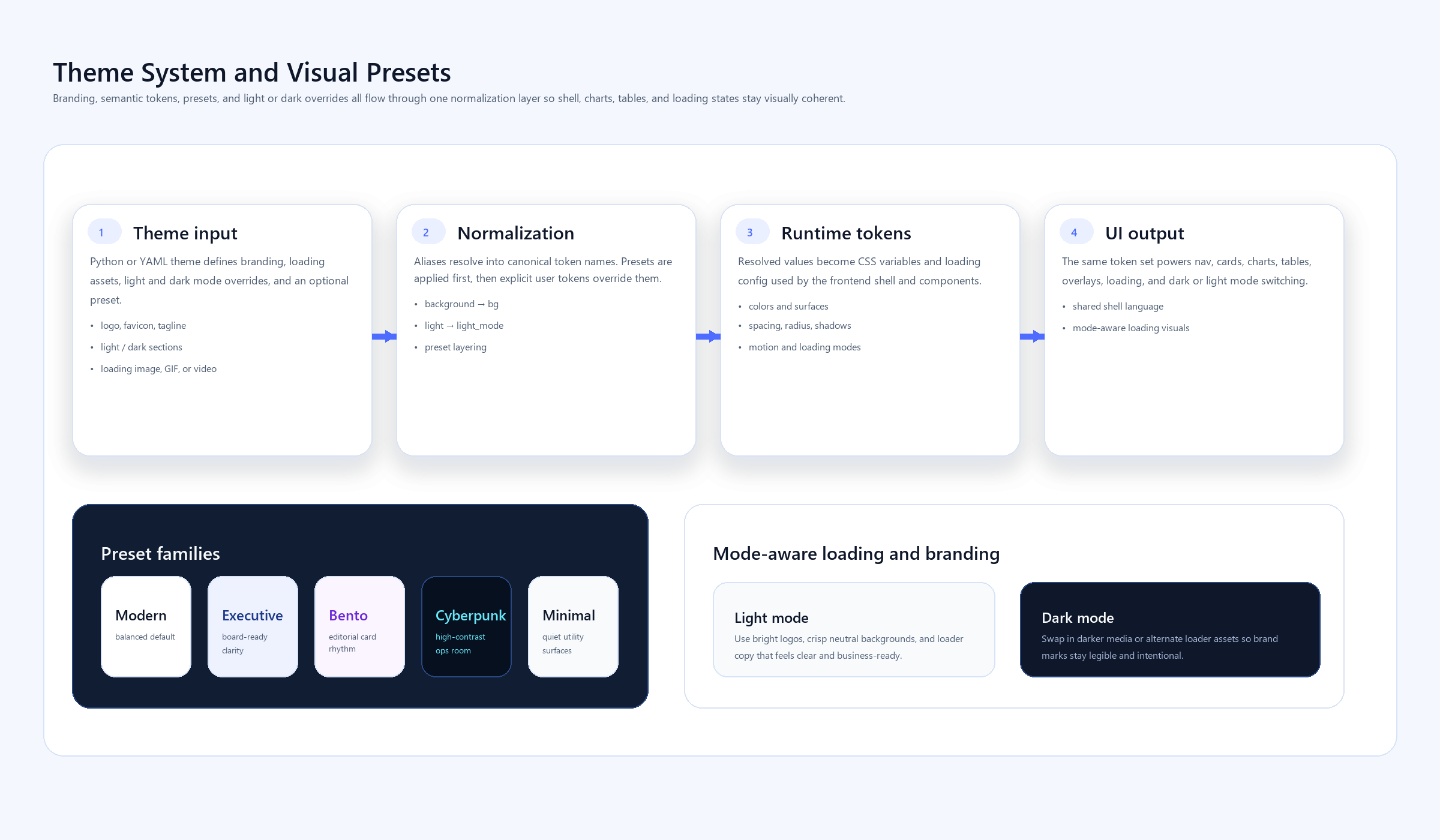
Fast Mental Model
The theme surface is split into these areas:
branding: title, logo, favicon, tagline, theme-toggle visibilityloading: startup copy, animation, image/GIF/video assetcolors: semantic and interactive color tokenssurfaces: canvas, muted layers, overlays, hover surfacestypography: body, heading, and mono stacksspacing,radius,shadows,motiondefault_mode,light_mode,dark_modestyle_preset
Example Theme
import brickflowui as db

app = db.App(
    theme={
        "default_mode": "light",
        "style_preset": "executive",
        "branding": {
            "title": "Acme Control Center",
            "tagline": "React components. Python syntax.",
            "logo": "assets/acme-logo.svg",
            "favicon": "assets/acme-mark.svg",
            "show_theme_toggle": True,
        },
        "loading": {
            "title": "Acme Control Center",
            "subtitle": "Runtime-secure analytics workspace",
            "message": "Connecting to warehouse and restoring your view...",
            "animation": "pulse",
            "asset": "assets/loader.gif",
        },
        "colors": {
            "primary": "#4361EE",
            "primary_hover": "#3650D8",
            "success": "#22C55E",
            "warning": "#F59E0B",
            "error": "#F43F5E",
        },
        "light_mode": {
            "colors": {
                "background": "#F8FAFC",
                "surface": "#FFFFFF",
                "text": "#0F172A",
                "text_muted": "#475569",
                "border": "#E2E8F0",
            }
        },
        "dark_mode": {
            "colors": {
                "background": "#0A0F1E",
                "surface": "#0F172A",
                "text": "#F1F5F9",
                "text_muted": "#94A3B8",
                "border": "#1E293B",
            }
        },
    }
)
Theme File Example
You can also keep the same structure in YAML or JSON and pass the file path to App(theme=...).
default_mode: light
style_preset: executive

branding:
  title: Acme Control Center
  tagline: React components. Python syntax.
  logo: assets/acme-logo.svg
  favicon: assets/acme-mark.svg
  show_theme_toggle: true

loading:
  title: Acme Control Center
  subtitle: Runtime-secure analytics workspace
  message: Connecting to warehouse and restoring your view...
  animation: pulse
  asset: assets/loader.gif

colors:
  primary: "#4361EE"
  primary_hover: "#3650D8"
  success: "#22C55E"
  warning: "#F59E0B"
  error: "#F43F5E"

light_mode:
  colors:
    background: "#F8FAFC"
    surface: "#FFFFFF"
    text: "#0F172A"
    text_muted: "#475569"
    border: "#E2E8F0"

dark_mode:
  colors:
    background: "#0A0F1E"
    surface: "#0F172A"
    text: "#F1F5F9"
    text_muted: "#94A3B8"
    border: "#1E293B"
Branding Details
These keys matter most for product identity:
branding.title: browser title and shell title whenApp(title=...)is left at defaultbranding.tagline: shell subtitle forSidebarandTopNavbranding.logo: shell logo when not passed directly toApp(logo=...)branding.favicon: injected into the HTML shellbranding.show_theme_toggle: enables the built-in dark/light switch in shell components
Loading Screen
The loading screen is customizable before the runtime connects:
- text-only loading state
- branded image or GIF
- branded video
- default spinner fallback
- animation hint such as
spinner,pulse, orfloat
app = db.App(
    loading={
        "title": "Astellas Study Portal",
        "subtitle": "Clinical operations workspace",
        "message": "Connecting to secured trial services...",
        "animation": "pulse",
        "asset": "assets/astellas-loader.gif",
        "dark": {
            "asset": "assets/astellas-loader-dark.gif"
        },
    }
)
If you provide loading.light and loading.dark, BrickflowUI uses the matching visual for the active theme mode.
Style Presets
BrickflowUI now supports additive presets so apps do not all feel like they come from one visual template.
modern: balanced default for most dashboards and portalsexecutive: cleaner enterprise presentation with softer surfaces and stronger hierarchybento: rounder cards and more editorial composition for product-style layoutscyberpunk: higher contrast, neon-accent control rooms and observability viewsminimal: stripped-back, quieter surfaces for simple internal tools
Use them like this:
app = db.App(
    theme={
        "style_preset": "bento",
        "default_mode": "light",
    }
)
Local Assets
Local paths are supported for:
branding.logobranding.faviconloading.assetloading.videodb.Image(...)db.Video(...)db.Hero(image=...)
BrickflowUI serves these through a runtime asset route automatically, so they work in the app without you manually configuring static hosting.
Dark And Light Mode
If your theme defines both modes, ThemeToggle and shell-level toggles switch the active mode in the browser.
If you define only a light theme, or you omit default_mode, BrickflowUI defaults to light mode. Dark mode is opt-in unless you explicitly configure it.
db.ThemeToggle()
You can also let TopNav or Sidebar handle it:
db.TopNav(
    items=[db.NavItem("Overview", "/")],
    brand_name="Acme Analytics",
    show_theme_toggle=True,
)
Image And Hero Branding
For inline logos or lightweight brand marks, use:
db.Image("assets/logo.svg", alt="Acme", variant="inline")
For circular avatars:
db.Image("assets/user.png", alt="Operator", variant="avatar", width="40px")
For hero-level brand presentation:
db.Hero(
    "Workspace command center",
    tagline="Built with BrickflowUI",
    image="assets/logo.svg",
)
Friendly Aliases
The theme loader accepts practical aliases:
brand_name->branding.titlebrand_tagline->branding.taglineprimary_hover->colors.primary-hovertext_muted->colors.text-mutedbackground->colors.bgfont_family->typography.sansbase_size->typography.base-sizelight_mode/dark_mode-> mode-specific overrides
Recommendation
Keep one product theme file per portal or platform area. Let application code override only the parts that are truly app-specific, such as page-level hero content or a temporary loading message. That keeps branding stable while still giving engineers room to move quickly.
Geometry-heavy design note
For more art-directed, glassmorphism-heavy, or geometric product surfaces:
- keep the background gradient in the page shell rather than every card
- use local SVG art for the hero and featured cards
- reserve the biggest radius and shadow values for only a few surfaces
- rely on
Text(style=...)andBadge(style=...)selectively, not everywhere
The reference example for this style is: